Scent Science & Colour Psychology:
A Digital Marketing Campaign at Yummi Candles

PROJECT SUMMARY
Most of Yummi Candles’ customers shop online from overseas, with top buyers including wedding and event planners and candle enthusiasts who rely on accurate color and scent guidance. The campaign aimed to address real-world factors like lighting and temperature, while inspiring users with seasonal color combinations and scent properties, helping them feel confident in choosing the perfect candles for their events or experiences.
The project included two website designs explaining scent science and color psychology, alongside two ongoing email series, all focused on high visual impact, brand confidence, and user inspiration rather than direct sales.
TIMELINE
June 2025 - Ongoing
ROLE
Graphic Designer
TEAM
Art Director, Project Manager
PROJECT TYPE
UX/UI Design, Digital Marketing
HOW MIGHT WE...
Rebrand the Yummi Candles Image
The previous Colour Explained page was hard to navigate and lacked meaningful guidance, making it difficult for customers, especially wedding and event planners, to make confident choices. It focused only on on-screen colour accuracy, without addressing real-world factors or inspiring how our candles look, smell, and feel in context.
The challenge was to create bold, colourful, and authoritative pages that spark creativity and position Yummi Candles as the go-to expert.


COLOUR EXPLAINED: WEB REDESIGN
The Psychology Behind Colour
After exploring multiple layouts and designs, the final Colour Explained webpage establishes a clear hierarchy of information, bringing the Colour Accuracy Chart higher on the page to minimize scroll time and increase usability. This page is designed to visually categorize information into lighting effects, essential colour terminology, and colour inspiration, helping users build a foundation before exploring which shades to purchase.

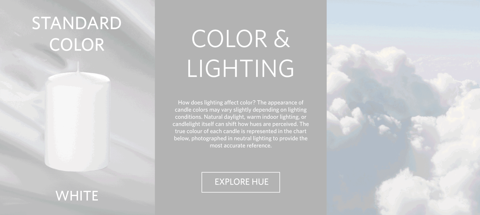
COLOUR ACCURACY CHART
The Colour Accuracy Chart demonstrates how lighting and screens can shift the appearance of Yummi Candle’s 45 candle shades. I redesigned the layout and corrected the colour set to create a clear, accessible reference for online shoppers.

LIGHTS AND SHADES
This section breaks down essential colour terminology and lighting conditions, illustrating how tints, tones, and shades are formed. Alongside a colour wheel overview, it gives users the clarity needed to make confident, context-aware colour choices based on their needs.

FIND YOUR PERFECT MATCH
This section showcases four colour-pairing strategies through swatches and styled photography, making candle selection more intuitive while encouraging bolder, more personal choices.

SCENT SCIENCE: 0-1 WEB DESIGN
Science Behind Scent & Feeling
Developed alongside the Colour Explained redesign, the Scent Science page helps online shoppers explore products they can’t experience in person. This page breaks down scent notes and families, explains the feelings each evokes, and guides users to candles that match their preferences, providing a clear path to discovering their perfect fragrance.

THE COMPLEXITY OF SCENT
By providing a foundation for understanding scent composition, this section educates users on fragrance blends by breaking down top, middle, and base notes and explaining why they matter.
The user learns what will be smelled immediately, the subtle hints that emerge, and the base notes that linger in the space. Common single-note fragrances are classified as top, middle, or base notes, to show where they typically appear in a blend.
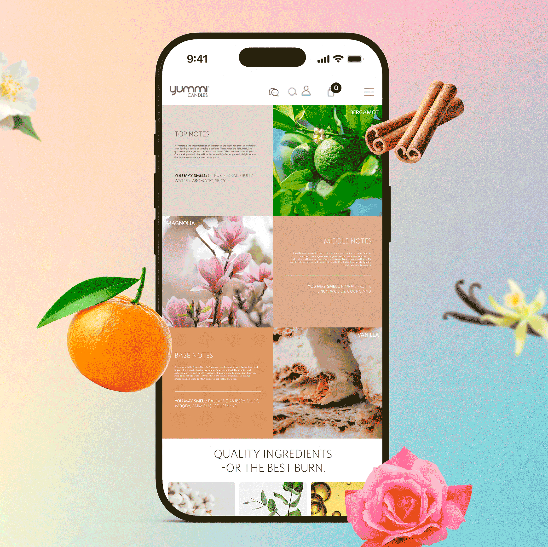

FRAGRANCE FAMILIES
This section breaks down scent families, highlighting their key traits, intensity, and what feelings they evoke. Common scents for each family are listed to help users identify fragrances they already enjoy, alongside recommended scented candles tailored to each scent family.
Designed to educate users about their favourite scents, this section makes exploring new fragrances approachable by linking them to scents they already know and love.
EMAIL MARKETING CAMPAIGNS
Seasonal Inspiration for Customers
We introduced Scent Series and Colour Story email campaigns that showcased seasonal scents and signature colours through scrapbook-inspired, editorial layouts. The refreshed look maintained Yummi’s elegance while boosting engagement and delivering conversion rates on par with promotional emails.


COLOUR STORY EMAILS
Targeted to event and wedding planners, Colour Story highlights 5–6 seasonal colour picks, focusing on visual cohesion and innovative colour combinations supported by inspiring imagery.
Colour Story Campaign
19% open rate
5.3% CVR


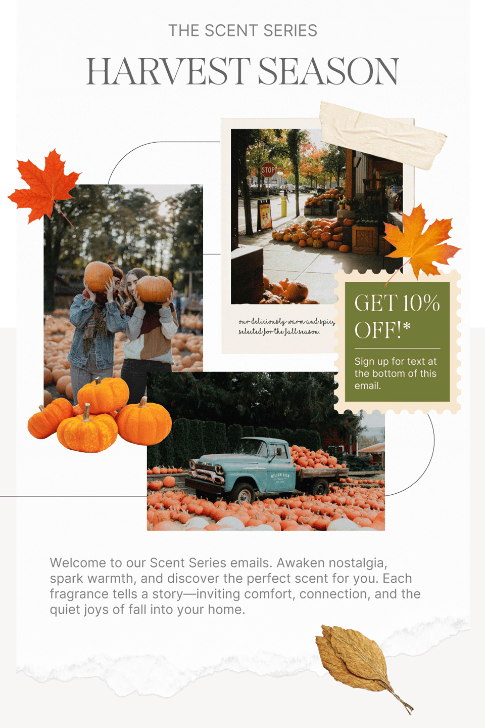
SCENT SERIES EMAILS
Scent Series highlights 5–6 seasonal scents and uses evocative imagery to visually translate what each candle smells like. Each email is curated focusing on the feelings, memories, and nostalgia each theme evokes.
Scent Series Campaign
22.1% open rate
5.0% CVR
PROJECT RESULTS
Designing Candle Experiences Users Can Trust
The finished scent and colour campaigns delivered clear, digestible experiences that highlighted key information without overwhelming users. Visuals helped customers envision products in real-world settings, while improved colour guidance and accurate shade references reduced confusion and lowered colour-related questions.
The refreshed layouts encouraged creativity and exploratory shopping, strengthening engagement and trust in how scents and colours are represented. Both the emails and webpage maintained strong conversion rates even without product pushes or promotions.